Entries in weddings (8)

Friday
Nov252011

a fall wedding

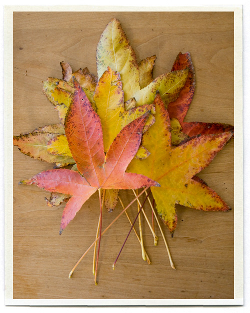
The leaves are finally changing here, just in time to make it feel a little bit like Fall right before Thanksgiving. Their pretty colors and shapes reminded me of my brother-in-law Justin and his darling wife Sarah's wedding, which happened two years ago this very week.

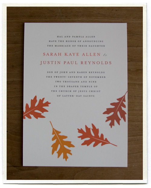
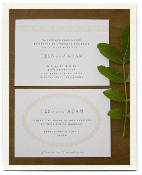
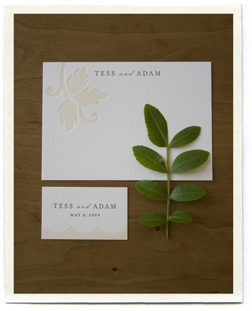
They asked me to design a simple wedding announcement, and we thought the fall leaves were a nice starting point. Three different colors of leaves with the text in a nice brown. I also printed some matching stationery for them to use as thank you cards.

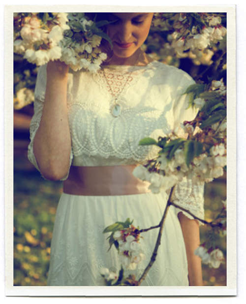
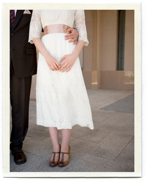
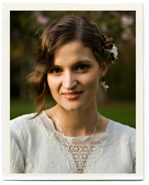
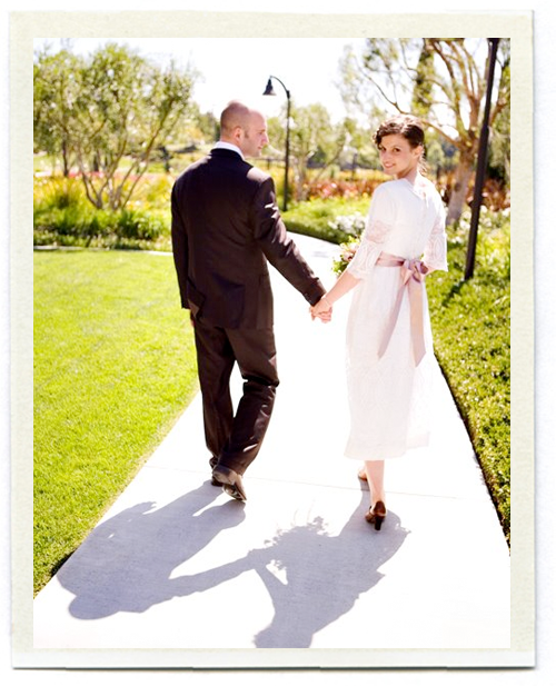
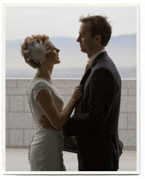
Sarah was a strikingly beautiful bride. I loved her short pixie cut (she looked just like a young Mia Farrow).

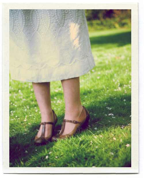
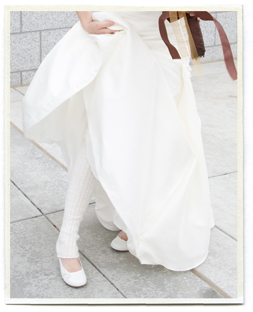
It was also super windy and really COLD, and it had been snowing off and on all week. But what bride wants to wear a coat? Sarah is a dancer and naturally wore knit leg warmers.

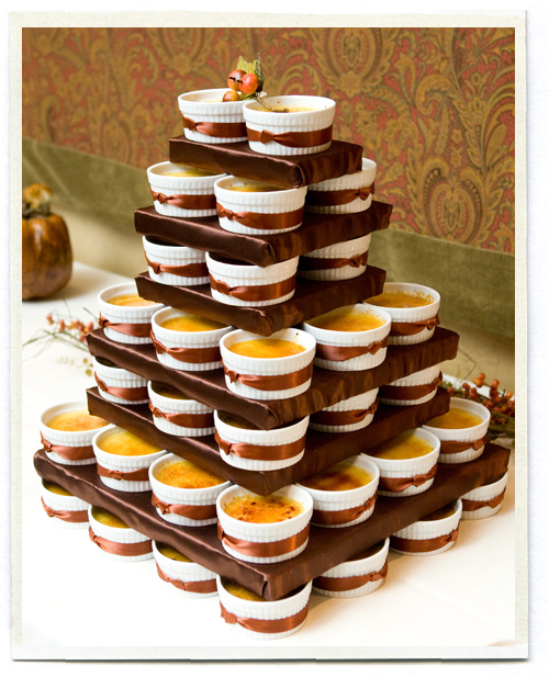
My favorite part was instead of having traditional wedding cake, they had a tower of creme brulee. The day before the wedding the bride and groom made batch after batch. I loved how they stacked them up so it still felt like a wedding cake (though much more delicious in my opinion!).

Happy Anniversary Justin and Sarah!

Monday
Mar082010

hello wedding

Last year I mentioned going on a photo shoot for a lovely wedding in Northern California. Nine months later, it is finally featured in the Spring 2010 issue of Martha Stewart Weddings. I was pleasantly suprised to see that it also landed on the cover!

The wedding was for Hello! Lucky stationery creative director Eunice Moyle, and it was ridiculously beautiful and a bit quirky and seriously fun. One of my favorite elements was the stationery, from the invitations themselves to the labels on the jelly jar favors, every piece was beautiful... and that pepper jelly, amazingly good on biscuits. Eunice also designed a set of playing cards with the motifs from the wedding, such a nice keepsake for each of the lucky guests. You can see more of the stationery suite here. (We had to wake up at 5 AM in order to get this shot of the stationery in the clover before the sun came up over the mountain... but I think it was worth it.)

Eunice and her sister Sabrina were so calm, great examples of grace under pressure. And I loved meeting their sweet father, who I chatted with between shots. He told me how he always read to the girls every night when they were little. "And not kid books either.. real books like Treasure Island." It was after speaking to him that I started reading more chapter books to my kids each night, instead of only picture books. Great advice!

Congrats to Eunice and Daniel..

Monday
Sep282009

nesting

I'm over at Kirei Nest today, answering a few questions about wedding gifts, dishware and house guests. The photo above is from Martha's house in Maine and is the reason I collect only white dishes. She calls it "The Great Wall of China". (And it's even more impressive in person!)

Thursday
Sep102009

secrets to a happy marriage

Joanna, over at Cup of Jo is off on her honeymoon. While she is away she is posting answers to the question "What's the secret to a happy marriage?" I've loved reading everyone's little ways of staying close. Check out my answer today.

This photo is from a little trip John and I took to Philadelphia 2 years ago, our first trip without the kids. A Man Full of Trouble was a popular tavern during the Revolutionary era. A parrot, a monkey, and a cat? Well that does sound like trouble.

Sunday
Jun072009

tess + adam

Tess and her lovely antique wedding dress have been showing up on a few of my favorite blogs lately. Tess lives in Seattle and asked me a few months ago to help design her wedding invitation (she was married a few weeks ago to a lucky young man named Adam).

To get a feel for what Tess was planning on doing for her wedding, my friend Beth (Tess' mother) came over to share some inspiration. The palette was cream and linen, with mossy greens and a touch of pale pink. Tess is a mycologist (lover of mushrooms and other fungi) so she wanted to incorporate mushrooms and other natural elements like moss and wood into the theme as well.

I first thought about incorporating faux bois into the invite, maybe with a nod to mushroom prints (which I adore). But I kept going back to that dress. Tess' dress is an antique gown she bought years and years ago at a vintage clothing store in New York. I love everything about it, especially the patterns in the lace.

I decided to use the overlapping circles from the front of her dress as the motif for the invitation. I love the symbolism of linked circles for a wedding invitation, linking a couple together, two families together. We letterpressed the invitations on Crane's thick Lettra paper in two colors, with gray for the type and a slight cream for the lace design. (Letterpress printing by Bjorn Press, who did a lovely job)

The inserts for the invitation also used designs I pulled from the lace on Tess' dress. The top card (below) uses the pattern from the lace at the neckline of the dress. The bottom card has a simple dotted circle, gathering in family and friends for the wedding.

The thank you cards (shown below) have a leaf design pulled from the lace on the back of the dress. The small cards (which were attached to favor boxes) have a simple scalloped design inspired by the dress' hem.

You can see more details of Tess' dress here, and details of Tess and Adam's beautiful wedding (with terrariums, ferns and a mushroom cake) here. (photos of Tess taken by photographer Rachel Thurston and used with her permission)

Congratulations Tess and Adam! Now go live a happy life!

Monday
May182009

seven years

"Sexiness wears thin after a while and beauty fades, but to be married to a man who makes you laugh everyday, ah, now that's a real treat." Joanne Newman

Happy Anniversary JR.

photograph by Kent Miles

Thursday
Jan152009

anna and mason


They've been going through their archives over at Martha Stewart Weddings and have added so many beautiful weddings to the site. A recent addition is the wedding of Anna Williams and Mason Adams. Anna is one of the nicest people you will ever meet, and an amazing photographer, and I had the pleasure of working with her countless times while I worked at Martha Stewart Living and Martha Stewart Kids. (She is also the photographer of both of Joelle's books).

I was completely thrilled when she asked me to help with her wedding invitations. Anna had assembled a gorgeous color story.. bright oranges, magentas, peaches, and soft pinks. We letterpressed the invite in three colors, with each letter a different color (which proved to be a bit of a nightmare for our printer, but the results were really beautiful!). We also letterpressed a gingham liner for the envelope. The colors in the magazine printed a bit dark, but you can see the actual colors of the invite below.

It's always a fun process to create a new wedding invitation, something unique that represents the personalities (and sometimes the quirks) of the couple getting married. I find it easier to design invitations for people I know, when I have a pretty good sense of who they are and exactly what they are hoping to see for their wedding. For Anna, I wanted her wedding to be as lovely as she is.. and I think we came close.

(photographs from the Winter 2008 issue of Martha Stewart Weddings)

Thursday
Jan082009

jen + ray

Remember this color story? It's still one of my favorites.

Now that the Winter 2009 issue of Martha Stewart Weddings is out, I can finally share what this color story was for... the wedding of my friend Jen Hoverson (Jen and her sister Joelle own Purlsoho). Jen's colors were orange and spring green, with a mix of prints and patterns thrown in.

The stationery was designed using green and orange dots with the couple's initials. Everything was letterpressed by Bryce Knudsen over at Bjorn Press (A fantastic letterpress studio if you are ever in the need for one..) The dotted paper was printed on a thin Japanese rice paper and used to wrap the invitations. The RSVP card had guests circle Y for Yes or N for No. We made the J and R coasters for the cocktail hour.

Menus were letterpressed and tucked into fabric napkins. Jen wanted to incorporate fabrics into her wedding (no surprise as the owner of a fabric store) and made napkins for each guest, with the help of her friends and family. Each table featured a different print in the orange and green spectrum. Each place setting also included a glass magnet with the guest's first initial. After the wedding, Jen took the napkins and made an amazing quilt from her sister Joelle's book "Last-Minute Patchwork and Quilted Gifts".

For the escort cards, we included a swatch of the fabric for that table. The Martha Stewart Weddings website has more information on how to make these cards, and a template you can download. I love these cards since they are a great way to use up leftover fabric scraps — I've already made them into Christmas tags. I have a few other ideas coming later this week!

See more photos of the beautiful couple here taken by the lovely Meg Smith. I was lucky enough to get to art direct the photo shoot of this wedding as well, and though it was a bit crazy running a shoot while an actual wedding was going on, working with Meg made it all the more enjoyable... she's lovely, as are her photographs.