Entries in design (51)

Wednesday
Mar112009

where I'd like to be..

Hanging out with a magenta octopus and a few gnomes at Heather's book party, starting in just a few hours. Oh, I wish I still lived in Brooklyn and could just hop on the train and see so many of my favorite people.

I will have to toast Heather and John and Melanie from way out here in California. If you haven't checked out Heather's book Weekend Sewing,  I suggest you do so.. It's a lovely book, and I'm so happy to have been a part of this team.

I'll be posting some photos later this week from our Weekend Sewing photoshoots, and I'll be doing my first blog giveaway, a copy of Heather's book..  so stay tuned.

Thursday
Feb052009

art for the people


Readymade has a great article about the WPA and the creation of the Federal Art Project, launched by Franklin Roosevelt during the Great Depression. As Steven Heller writes in the introduction "The FAP served a dual purpose: It gave unemployed artists work while demonstratively branding the virtues of the nation through rousing mass communication." Most posters were silkscreened, which explains the lack of photography and the simple typography (I love them all). 

The posters promoted all kinds of topics including basic hygiene, tourism, health topics, workplace safety, theater, education, public libraries, and community events. Though I feel a bit bad for the poor fellow who had to do the poster for venereal diseases.

Readymade then asked 5 artists to create a WPA inspired poster for today. My favorite comes from Nick Dewar, an illustrator who always makes me happy with his hand drawn type. (I had the pleasure of working with him once for an article I did at MS Living). You can download a large PDF version of his poster here.

Here are a few of my favorite WPA posters:


Saturday
Jan312009

this week's library book

Such a jewel this week. I went to the library for something else, and making my way through the J's stumbled upon The Incredible Book Eating Boy by Oliver Jeffers. A good cover will usually catch my eye, and the hand lettering on this one is lovely.

Henry loves to eat books. First one page at a time, then entire books in one go. And the more he eats, the smarter he gets. 

If he reads a book about rockets, he can remember every detail. Soon he is the smartest kid in his class, and is explaining things to his teacher.

When he starts eating too many books too fast, the contents start to get all mixed up. When he tries to remember something, all that comes out is confused mumbles.

So he has to give up eating books, but he starts reading them instead.. and gets smart the old fashioned way. (Although there is a nice size bite out of the back cover.. he must nibble now and then.)

I'm a lover of paper. Striped, gridded, lined, bright white, old and faded.. I love it all. What really makes me love this book is how Jeffers uses different kinds of paper as the backgrounds for his illustrations. And he leaves it messy, with the 3 ring holes intact or the torn edges showing. It's such a special little treat.

Thursday
Jan082009

jen + ray

Remember this color story? It's still one of my favorites.

Now that the Winter 2009 issue of Martha Stewart Weddings is out, I can finally share what this color story was for... the wedding of my friend Jen Hoverson (Jen and her sister Joelle own Purlsoho). Jen's colors were orange and spring green, with a mix of prints and patterns thrown in.

The stationery was designed using green and orange dots with the couple's initials. Everything was letterpressed by Bryce Knudsen over at Bjorn Press (A fantastic letterpress studio if you are ever in the need for one..) The dotted paper was printed on a thin Japanese rice paper and used to wrap the invitations. The RSVP card had guests circle Y for Yes or N for No. We made the J and R coasters for the cocktail hour.

Menus were letterpressed and tucked into fabric napkins. Jen wanted to incorporate fabrics into her wedding (no surprise as the owner of a fabric store) and made napkins for each guest, with the help of her friends and family. Each table featured a different print in the orange and green spectrum. Each place setting also included a glass magnet with the guest's first initial. After the wedding, Jen took the napkins and made an amazing quilt from her sister Joelle's book "Last-Minute Patchwork and Quilted Gifts".

For the escort cards, we included a swatch of the fabric for that table. The Martha Stewart Weddings website has more information on how to make these cards, and a template you can download. I love these cards since they are a great way to use up leftover fabric scraps โ€” I've already made them into Christmas tags. I have a few other ideas coming later this week!

See more photos of the beautiful couple here taken by the lovely Meg Smith. I was lucky enough to get to art direct the photo shoot of this wedding as well, and though it was a bit crazy running a shoot while an actual wedding was going on, working with Meg made it all the more enjoyable... she's lovely, as are her photographs.

Friday
Jan022009

for the love of a calendar

I love a new year, a fresh start, and best of all โ€” a brand new weekly desk calendar. For a design geek like myself, it can't be just any calendar. Here's what works for me: 1) it needs to have one week per spread  2) it needs to lie flat when open, spiral-bound works best 3) each week must be divided into days, with ample space for writing in appointments, birthdays, etc  4) it can't be larger than 6" x 9" since it sits open on my desk all year long, and 5) it needs to look good.

After years of buying all different kinds of calendars, I finally found the calendar of my dreams back in 2001. On my way home from work, I stumbled into the Ordning + Reda store on the Upper East Side and there it was...

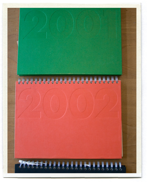
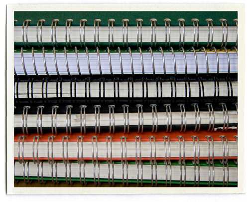
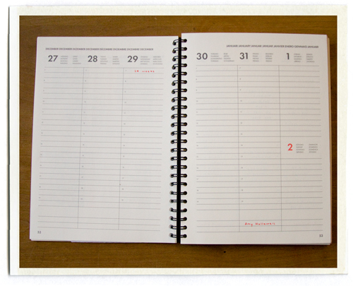
The Ordning + Reda cloth diary. It was the perfect size. It came in an array of colors. It had the perfect amount of space between the lines for my tiny handwriting. The paper felt nice. It was beautifully designed (I love those little red numbers). And it was Swedish (everyone knows Sweden is the land of all things beautiful and well designed).   

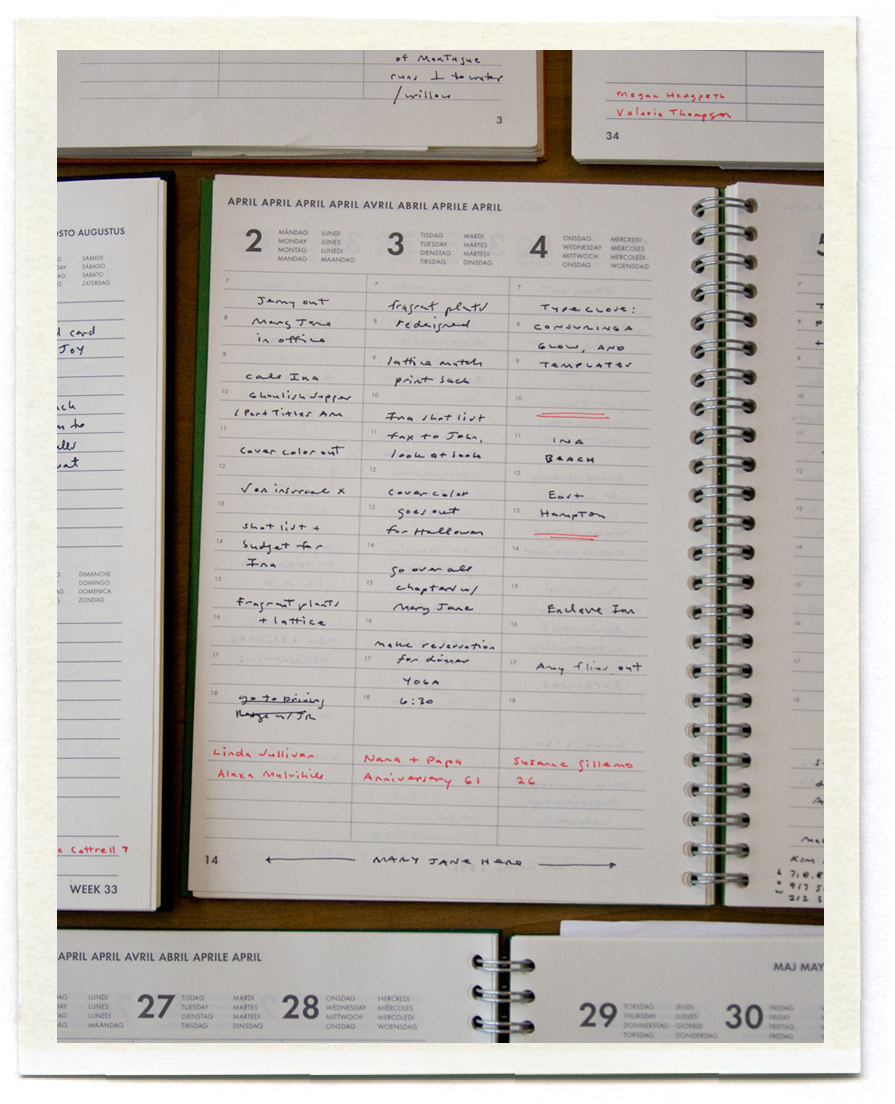
For the next few years, all was well. I developed a little system with my calendars. Birthdays and anniversaries were written at the bottom of the page in red, appointments and other to do lists were written in black. In 2002, I got married. And JR started giving me a calendar for Christmas, a different color each year. 

And then a horrible thing happened. Ordning + Reda closed their US stores! But we were not deterred. In 2003 I found one at the Swedish import store in midtown, but they stopped carrying them soon after. Then JR found them at the Bodum store in the meatpacking district, and for the next few years I always found one waiting for me under the Christmas tree. But last year the Bodum store stopped carrying them, and as far as we know, they aren't available in the US anymore. Last year I protested and didn't have a desk calendar at all. But I miss it.

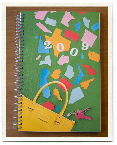
I've considered a few options, (like this, or this, or this, or this) and this year I decided to go with the Kate Spade weekly calendar. It meets all of my requirements (even if the lines are a bit too widely spaced for my writing) and though I don't love it the way I love my old calendars... it'll work.

 Now does anyone have a connection in Sweden who can hook me up for 2010?

Friday
Nov282008

the clothespin people

My friend Heather Ross has posted a very funny look at her creative process designing her latest fabric line for Westminster. We like to shoot each other emails when we're working on something.. it's always nice to have fresh eyes look at your work and offer opinions. The print she is currently working on involves clothespins and clothespin people. When I told her the clothespins looked like little naked mannequins, she sent me the illustration below. You can read her very funny post here.


Thursday
Nov062008

market recap

As promised before I got sidetracked with Halloween and the election, here are a few of my favorite things at Quilt Market..

Vintage trims and buttons arranged by color from Dusty's Vintage:

A bounty of all things lovely and Japanese at the kokka booth:

These vintage ads for Bernina sewing machines: 

Beautiful quilts at the Lecien booth:

And of course, our Oliver + S booth, featuring two new outfits for Spring 09:

Another Quilt Market come and gone.. 

Thursday
Oct232008

to market, to market

I've been lucky enough to be a part of launching Oliver + S, a lovely little company that makes children's clothing patterns (created by the talented Liesl Gibson). Designing patterns and tissues and paper dolls and booths for trade shows is all new to me, but it's been such a fun ride.. We're off to Quilt Market yet again, in Houston this time. I'll post a full report when I'm back on Tuesday!

Tuesday
Oct212008

envelopes

I am a huge fan of envelope security patterns.. I know I'm not alone in this (there's a lovely collection here). I love how they are never quite perfect, like they've been xeroxed on an old copy machine. I've been cutting all our envelopes down to little squares, perfect for little notes (good thing we pay most of our bills online!).

Tuesday
Oct072008

pretty little packages


I love getting something in the mail from Purlsoho

Especially when it contains one lovely letterpressed gift certificate..  

(Disclaimer: My opinions might be a bit biased since I am also their designer.. )