Entries in stationery (16)

Monday
Jan182010

a new years card

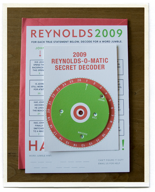
I love sending out holiday cards and each year we try to come up with something new and different. I have to give credit to my husband for the idea for 2009. "We should do some kind of decoder - like in The Christmas Story." I knew exactly what he was talking about, Ralphie holed up in his bathroom with his secret decoder trying to figure out the message from Little Orpan Annie.
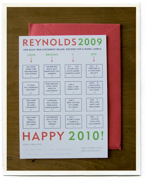
For our card we came up with a series of four statements for each person in our family, for example "Was Bee Captain Hook for Halloween?". (As always, I have changed my children's names to protect their privacy, my 5 year old son goes by "C" and my 3 year old daughter goes by "Bee") Some of the statements are true, and a few are false.
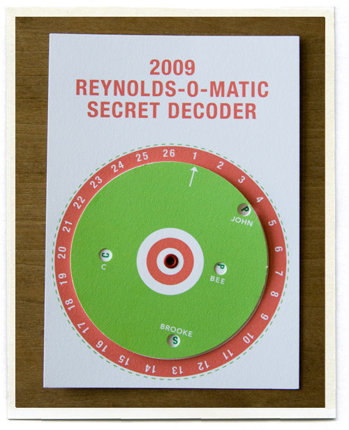
Each statement has a green number at the bottom of the box. If the statement is true, you grab your decoder and set the arrow on that number, and then write down the letter that appears in Bee's circle. (If the statement is false you won't see a number, but a red dot to let you know you have that answer wrong.) After decoding all the statements, you end up with 13 letters. The letters are in no particular order, so you still have to figure out the word jumble to figure out the four word message.

Figuring out the exact placement of the dots and how to perfectly place each letter of the alphabet was a feat in itself. Thankfully I have a very patient husband who worked out all the logistics of how this card worked, and then I just had to make it look good.

I really like the idea of making a holiday card more interactive, and it's just made it more fun to hear back from our friends as they solve the puzzle and email us to share the answer. John really wanted it to be difficult, he wanted people to have to take a little time to work it out. (Although several of our friends have told us that we made this a little TOO hard..) The puzzle is a bit of news about our family and what is to come in 2010, and we are still waiting patiently for several of our friends to solve it.

I'll share the answer with you in a few weeks, I don't want to give it away just yet!

Monday
Nov162009

lovely lovely

About three years ago I was freelancing on a color palette story for Martha Stewart Weddings. We needed some paper goods and the stylist, the uber-talented Shana Faust, sent a query to Sharilyn of lovelydesign asking if she might have anything we could use. Sharilyn sent us a package that had us swooning and in it she included one of her wooden card catalogs. Everyone in the office wanted one. So when my mom asked me what I wanted for my birthday that year, I knew. And I have had Sharilyn's beautiful card catalog sitting on my desk ever since.

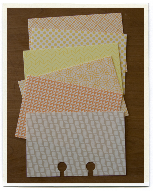
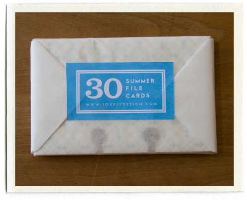
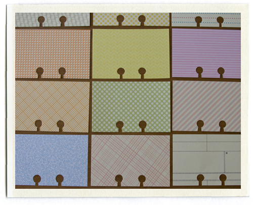
Sharilyn has now started selling little packs of cards to add to your card catalog, she designs the patterns herself. She did a little giveaway on her blog and lo and behold, I was one of the winners! Soon after this sweet package arrived at my door.

I love them. I don't usually talk about products on my blog, I try to keep things as commercial free as I can... but when I see a product that is made with so much care, I just wanted to tip my hat a bit. Thank you for my cards Sharilyn.. I love them!

Friday
Nov132009

wrapping things up

I'm wrapping up my week at Design*Sponge with two posts: one on ABC wrapping ideas, and the other a downloadable ABC card you can make yourself. I'll be back to business as usual here on Monday!

Sunday
Jun072009

tess + adam

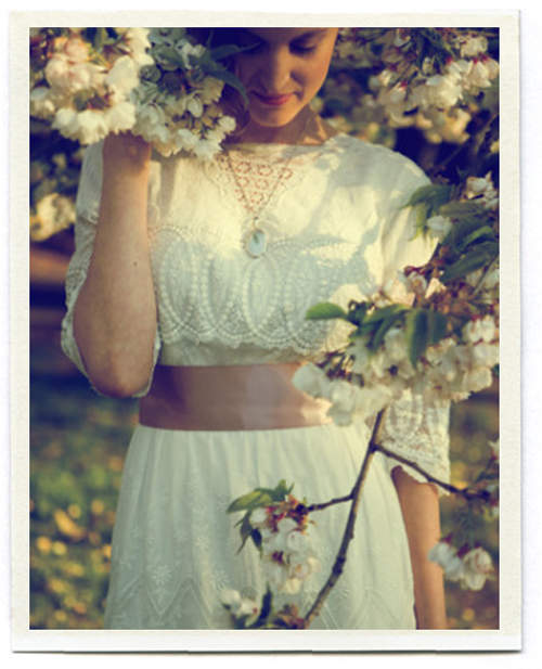
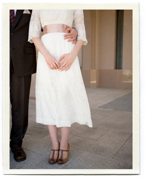
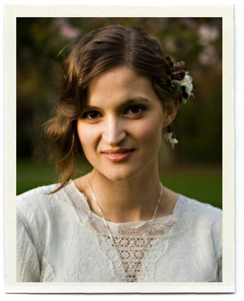
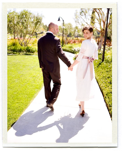
Tess and her lovely antique wedding dress have been showing up on a few of my favorite blogs lately. Tess lives in Seattle and asked me a few months ago to help design her wedding invitation (she was married a few weeks ago to a lucky young man named Adam).

To get a feel for what Tess was planning on doing for her wedding, my friend Beth (Tess' mother) came over to share some inspiration. The palette was cream and linen, with mossy greens and a touch of pale pink. Tess is a mycologist (lover of mushrooms and other fungi) so she wanted to incorporate mushrooms and other natural elements like moss and wood into the theme as well.

I first thought about incorporating faux bois into the invite, maybe with a nod to mushroom prints (which I adore). But I kept going back to that dress. Tess' dress is an antique gown she bought years and years ago at a vintage clothing store in New York. I love everything about it, especially the patterns in the lace.

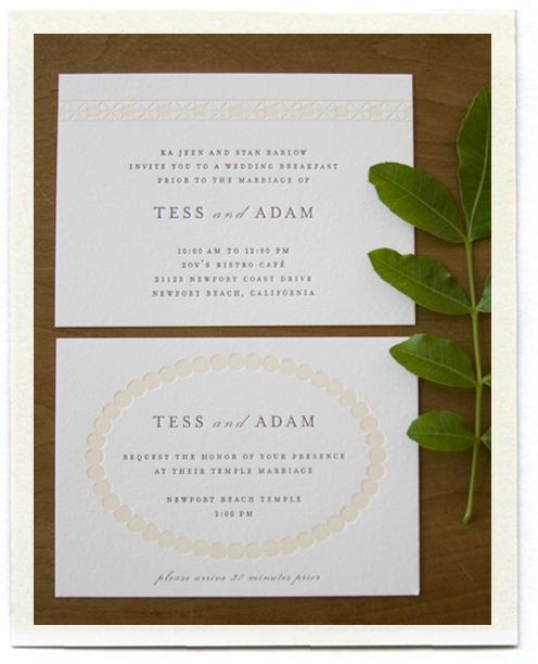
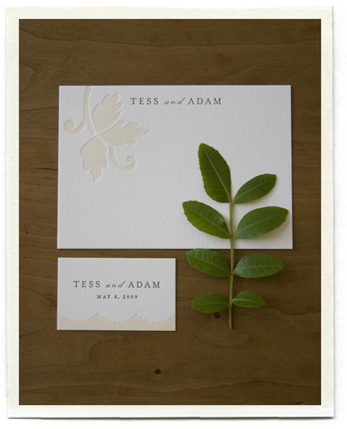
I decided to use the overlapping circles from the front of her dress as the motif for the invitation. I love the symbolism of linked circles for a wedding invitation, linking a couple together, two families together. We letterpressed the invitations on Crane's thick Lettra paper in two colors, with gray for the type and a slight cream for the lace design. (Letterpress printing by Bjorn Press, who did a lovely job)

The inserts for the invitation also used designs I pulled from the lace on Tess' dress. The top card (below) uses the pattern from the lace at the neckline of the dress. The bottom card has a simple dotted circle, gathering in family and friends for the wedding.

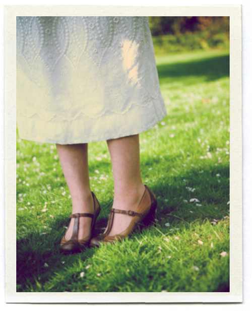
The thank you cards (shown below) have a leaf design pulled from the lace on the back of the dress. The small cards (which were attached to favor boxes) have a simple scalloped design inspired by the dress' hem.

You can see more details of Tess' dress here, and details of Tess and Adam's beautiful wedding (with terrariums, ferns and a mushroom cake) here. (photos of Tess taken by photographer Rachel Thurston and used with her permission)

Congratulations Tess and Adam! Now go live a happy life!

Thursday
Jan152009

anna and mason


They've been going through their archives over at Martha Stewart Weddings and have added so many beautiful weddings to the site. A recent addition is the wedding of Anna Williams and Mason Adams. Anna is one of the nicest people you will ever meet, and an amazing photographer, and I had the pleasure of working with her countless times while I worked at Martha Stewart Living and Martha Stewart Kids. (She is also the photographer of both of Joelle's books).

I was completely thrilled when she asked me to help with her wedding invitations. Anna had assembled a gorgeous color story.. bright oranges, magentas, peaches, and soft pinks. We letterpressed the invite in three colors, with each letter a different color (which proved to be a bit of a nightmare for our printer, but the results were really beautiful!). We also letterpressed a gingham liner for the envelope. The colors in the magazine printed a bit dark, but you can see the actual colors of the invite below.

It's always a fun process to create a new wedding invitation, something unique that represents the personalities (and sometimes the quirks) of the couple getting married. I find it easier to design invitations for people I know, when I have a pretty good sense of who they are and exactly what they are hoping to see for their wedding. For Anna, I wanted her wedding to be as lovely as she is.. and I think we came close.

(photographs from the Winter 2008 issue of Martha Stewart Weddings)

Thursday
Jan082009

jen + ray

Remember this color story? It's still one of my favorites.

Now that the Winter 2009 issue of Martha Stewart Weddings is out, I can finally share what this color story was for... the wedding of my friend Jen Hoverson (Jen and her sister Joelle own Purlsoho). Jen's colors were orange and spring green, with a mix of prints and patterns thrown in.

The stationery was designed using green and orange dots with the couple's initials. Everything was letterpressed by Bryce Knudsen over at Bjorn Press (A fantastic letterpress studio if you are ever in the need for one..) The dotted paper was printed on a thin Japanese rice paper and used to wrap the invitations. The RSVP card had guests circle Y for Yes or N for No. We made the J and R coasters for the cocktail hour.

Menus were letterpressed and tucked into fabric napkins. Jen wanted to incorporate fabrics into her wedding (no surprise as the owner of a fabric store) and made napkins for each guest, with the help of her friends and family. Each table featured a different print in the orange and green spectrum. Each place setting also included a glass magnet with the guest's first initial. After the wedding, Jen took the napkins and made an amazing quilt from her sister Joelle's book "Last-Minute Patchwork and Quilted Gifts".

For the escort cards, we included a swatch of the fabric for that table. The Martha Stewart Weddings website has more information on how to make these cards, and a template you can download. I love these cards since they are a great way to use up leftover fabric scraps — I've already made them into Christmas tags. I have a few other ideas coming later this week!

See more photos of the beautiful couple here taken by the lovely Meg Smith. I was lucky enough to get to art direct the photo shoot of this wedding as well, and though it was a bit crazy running a shoot while an actual wedding was going on, working with Meg made it all the more enjoyable... she's lovely, as are her photographs.

Page 1 2